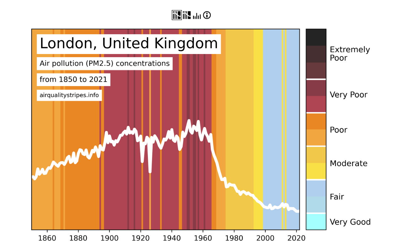
Air quality stripes have been launched to show how the particulate matter have changed worldwide since 1850, as described in the article here. The new diagrams display global contrasts in the change of particulate matter, depending on how developed the country is. Climate stripes were first introduced in 2019 which displays the global average temperature since 1850. Since these have been introduced, they have been widely shared on a variety of stages including at festivals, on cars, and on sports kits. The stripes for both global temperature and air quality visually tell the story of the trends. The stripes can be found here, where you are able to select a city to view to understand how the air quality has changed.